Client
quip
Category
Oral care, color, material and finish
Year
2023, ongoing
Scope
Industrial design, form development, CMF
Channel
Retail & DTC
Constraint
Quarterly limited-edition drops, each one there to bring new people to quip. The pull in that format is toward whatever is easy to produce, and what that yields is a recolor with a name attached to it.
Two limits made it harder than that. Each drop had to carry real meaning rather than a swapped color, and none of it could change core tooling or disrupt production. Every idea had to live entirely in finish.
Decision
The theme leads. Quarterly drops exist to bring new people to the brand, and a theme chosen because a process happened to be available is a color swap with a story attached. So themes were selected on whether they actually belong to quip, and the finish then had to find a way to deliver them.
Substrate then became the strict filter. The range spans silicone, metal and molded plastic, and a process that carries a theme on one part does not necessarily carry it on the part beside it, so each drop had to be resolved per material to still read as one object.
Some themes did not survive the filter. Where a theme could only be executed with new tooling or a significant change to production, it was abandoned rather than compromised, because a drop that misses the goal it exists for is not worth the quarter.
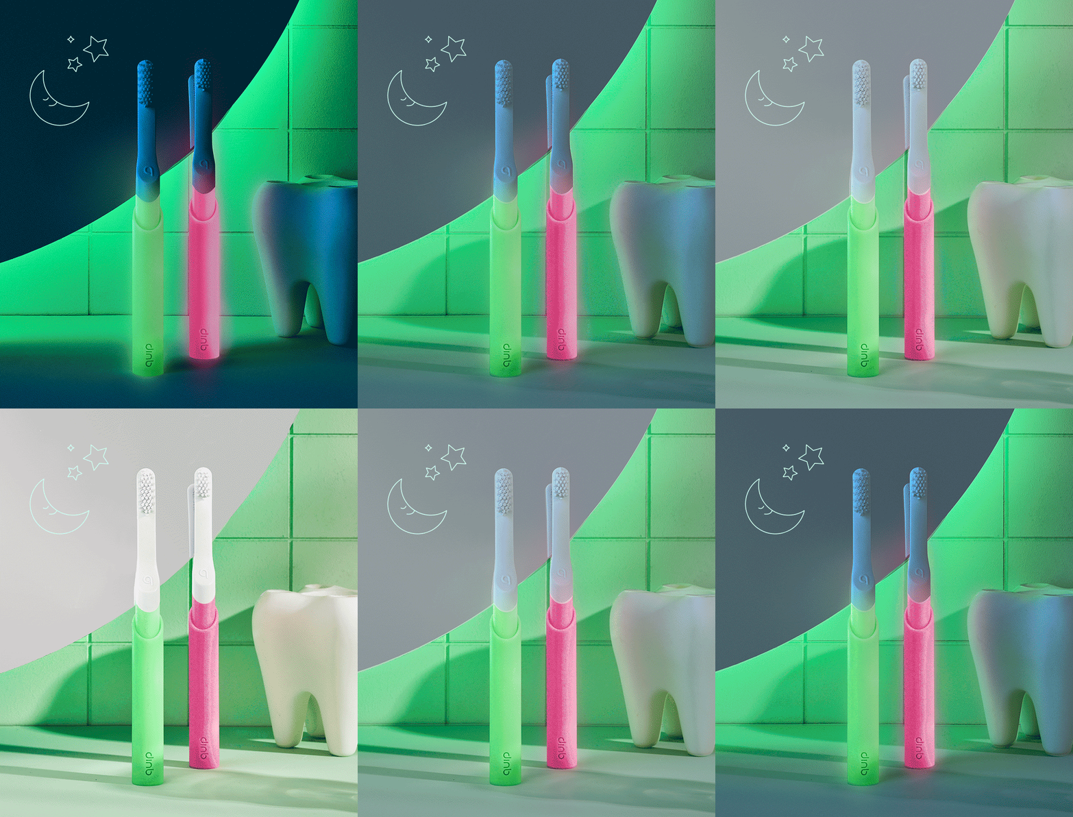
The filter also worked the other way. A no from a material forced harder thinking, and the glow brush is where that shows. It landed on a material change.

Finish
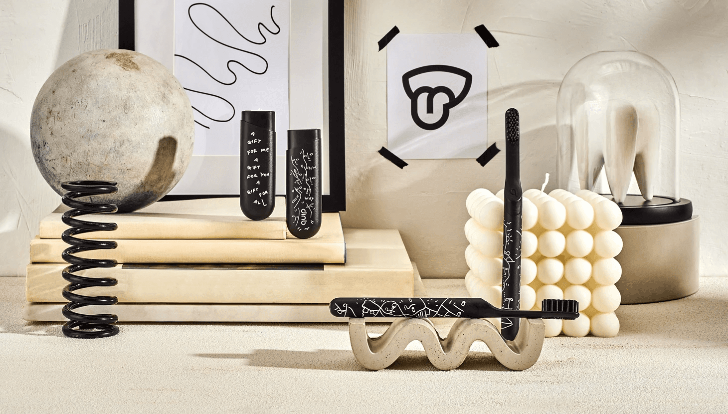
PVD metallic coatings, laser engraving, translucency, glow pigments, specialty inks and textures, adapted per substrate across silicone, metal and molded plastic. Drops include Pride, Glow Kids and Shantell Martin.

More work