Client
Paris Baguette
Category
Food and beverage, structural packaging
Year
2012
Scope
Industrial design, form development, CMF
Channel
Retail
Constraint
Paris Baguette was introducing a prepackaged iced coffee into their Korean cafes, and glass came with the brief.
The category had settled. The large brands had all arrived at nostalgic milk-bottle forms, so the shelf held one silhouette in different labels. The difficulty was deriving a form that felt genuinely unlike them rather than a variation on them.
Decision
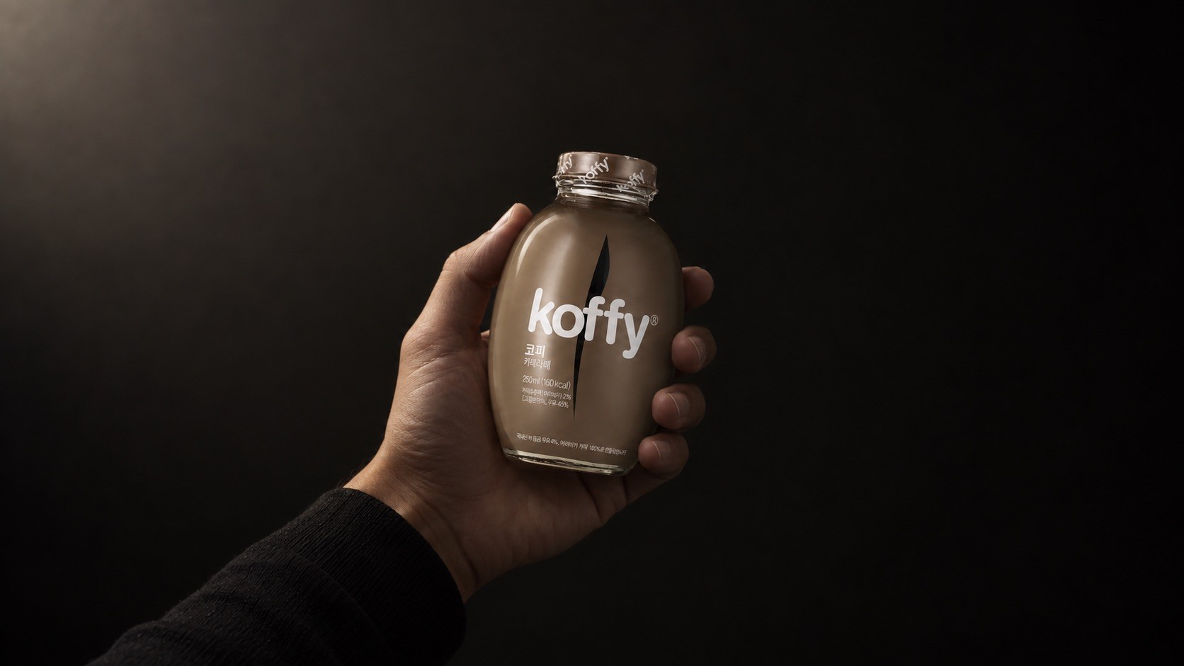
Glass was given, so the open question was the shape inside it. A milk bottle leaves differentiation to the neck, the cap and the label, which is where every competitor was already working. The form was derived from the coffee bean instead, and an ovoid is not a shape anyone reaches by restyling a milk bottle.
What it cost was the sticker. A flat label will not sit on a compound curve, so the bottle moved to a shrink label, and a shrink label is not a rectangle that gets drawn and applied. It distorts as it conforms, so the artwork has to be built to come out right after shrinking rather than before. That work ran alongside the bottle rather than after it, with the graphic designer developing the artwork and engineering partners resolving the ratios, so the graphic and the form were solved as one thing.
The label is clear apart from the branding and the required copy, so the coffee still reads through the glass the way the brief intended.
And the shape turned out to suit the process it forced. An ovoid is round in horizontal cross section, so there is no orientation to set and hold through labeling, which is exactly the problem a square bottle creates. The form that made the sticker impossible is the form that made the alternative easy.

Finish
Clear molded glass, ovoid coffee-bean profile, clear shrink label printed with branding and required copy. Caramel Macchiato and Café Latte.
Recognition
Red Dot: Best of the Best 2013, Brands & Communication Design

Designed At
Karim Rashid Studio
More work